Ta-da! 🎉🎉🎉
Welcome to my very first website teardown—even though I feel like I’ve been doing them in my head for my entire marketing career.
Websites are every SaaS company’s first line of defense.
Most startups can’t afford to have a website that doesn’t enable them to:
1. Build relationships with their customers
2. Ultimately sell their product
Every visit counts—especially if it’s a qualified visit.
Because I understand how important messaging, traffic, and conversion are in the early stages, I’m here to offer my first impressions, feedback, and general thoughts on how well that first line of defense is built and prepared!
I make a few mistakes while recording (ugh… desktop notifications reeaalllyyy kill me) but overall, I think I got the hang of it. 😉
ClientSherpa—Friendly, automated client intake for attorneys
We wouldn’t be here if it weren’t for the idea from a good ‘ol series of tweets!
Here’s how it shook out.
Would anyone be interested in or watch live website and/or business teardowns? Maybe on something like Twitch or YouTube?
(“Teardown” feels like the wrong word for this…more like “give stream-of-consciousness UI/UX/marketing/business feedback”)
— Josh Pigford (@Shpigford) March 29, 2018
@AsiaMatos sign me up @ClientSherpa
— Bryan Marble – bsky (@LostMahbles) March 29, 2018
Well NOW I'm excited. pic.twitter.com/T0h1vC3L2I
— Asia Orangio ✨ (@AsiaOrangio) May 11, 2018
So of course, I dig in.
HUGE thanks to ClientSherpa for being my first guinea pig. 🙏
I’m in the process of figuring out a system through which I can discuss these websites. (So if you like the way I discuss websites, let me know in the comments!)
Going in willy-nilly is probably fine for most onlookers, but I like to have a set of things to think about when dissecting and analyzing the parts.
Based on the feedback I think is most important, I arrived at 5 points + the ultimate test:
1. Above-the-fold
2. The Basics
3. Copy
4. Design
5. Content
6. The Conversion Test: Would I sign up?
What I’m not covering:
– Ultimate conversion rates (because I don’t have those details!)
– Pricing—I have Patrick Campbell at Price Intelligently for that 😉
– Onboarding—because Val Geisler is my onboarding guru ❤️
Let’s dig in, shall we?
ClientSherpa’s Above-the-Fold
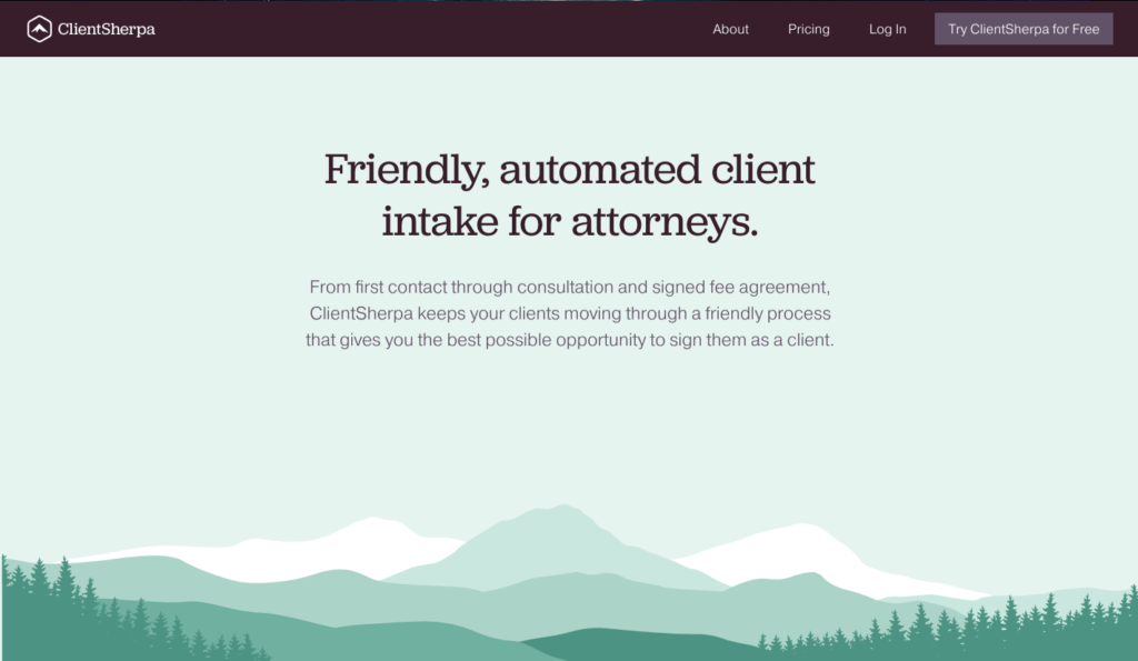
My literal first thought was “Oh cool. I bet the image will load any second.”
… And so I waited.
.. And then it didn’t load. 🙃
(whispers) ….because there isn’t one.
I admit I was surprised.
Reading the headline and its description below, I pretty much get the gist:
- WHO: It’s for attorneys
- WHAT: It’s for client intake
- WHY: Because getting clients to do the intake thing sucks? A lot?
- HOW: I think it’s through some kind of software
- WHERE: If I didn’t see the “try ClientSherpa for free”, I wouldn’t know where I’m supposed to go from here (except for, of course, to scroll).
That “HOW” is important. There’s no product image above-the-fold, and that might be a conscious decision (totally legit if it helps conversion rates), but not knowing what I’m looking at might be confusing.
Is this software? I guess… but without scrolling, I really don’t know.
Could just be me, but a high-quality, solid product image is missing.
Another thing I noticed? No immediate call-to-action above-the-fold.
We have this almost-ghost-button in the menu. It’s not totally transparent, but it’s light enough to get lost.
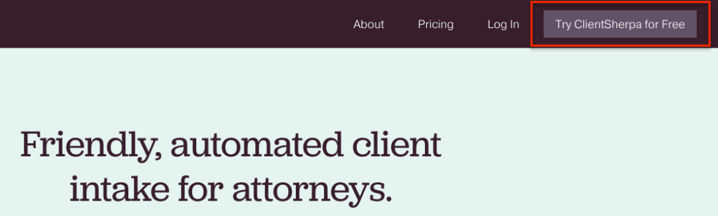
There it is. Just chillin’.
As they say, if you want someone to click it, better make it stand out.
(We actually see this later in the page which makes me pretty happy.)
The Basics
Let’s do a quick check for the basics.
I consider “the basics” to be just that—the things that I, both as a complete stranger to the brand and a SaaS marketer, expect to see in a website & landing page.
Here’s the checklist I always use:
- Is there a value proposition? Yes – although I think it could be pushed further and made even more compelling.
- Is there a main call-to-action? Yes – sign up for the free trial!
- Is there a way to get in touch with the creators of this product / website? Yes – there’s a “contact us” link in the footer of the page.
- Is there some kind of social proof? Yes – all the way at the bottom of the page, there are two customer testimonials.
- Is there an overview of either the process or the product itself? Yes – there’s both product images and feature highlights and a page that covers the story of how the tool works in real life.
- Is there a way to learn more about the creators? Kind of – there’s an “About Us” page, but it’s not really about the makers! Seems pretty dodgy to me…
So okay! Five out of six; not too shabby. Here’s a few noteworthy deep-dives…
The Social Proof
I loved these customer testimonials.
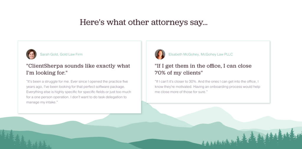
Customer testimonials are like the “hey look at me! I’m valuable and credible!” for a SaaS company, and especially for a startup.
As a startup, you’re kinda new to the game, and anything you can do to put people at ease and gain trust is a must-have.
Testimonials also need to resonate with your target audience, and be as relevant to the product as possible.
Here, the testimonial on the right is 🔥.
“If I get them in the office, I can close 70% of my clients.”
WOO BOY. I’m shook.
Now that’s a powerful value proposition and testimonial.
Think about it — if she doesn’t get those people in the door due to some lack of intake or just terrible processing, SHE DOESN’T MAKE MONEY.
Even as a not-actual-lawyer, I felt that in my gut.
That makes me think the value proposition could be pushed further into more of a concrete, realized outcome and ClientSherpa focus more on the actual revenue results these lawyers see when they improve their intake.
That’s powerful.
But you know what the biggest problem is?
That powerful asf testimonial is aaaaaaallllll the way at the bottom of the page.
And it’s tiny.
We’re making two strong assumptions:
1. People are going to scroll that far (better install Hotjar to find out)
2. They’re going to read that testimonial
I highly recommend making those testimonials bigger and pulling them up on the page.
The CTA
Remember when I said there’s a CTA?
It’s here at the bottom of the page.
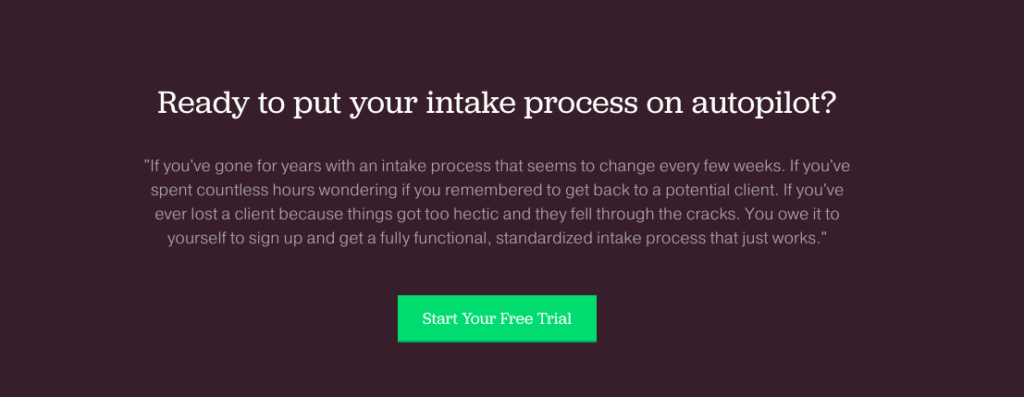
It’s cool that it’s at the bottom—most CTAs are.
But I wanted to note that this is a much more visually compelling CTA than the one in the navigation bar.
That green pops. And it makes me think of all the money I’m going to have because my intake process is going to be 🔥.
Copy
When I work with new clients, I’m always scrutinizing their copy.
I’m looking to see how well they’re able to:
– capture the problem and the pain,
– make me relive that pain all over again, and
– communicate why their solution is the best solution to my pain.
Overall, ClientSherpa definitely understands their target audience (attorneys) and uses the language they might expect (intake, agreements, etc).
What I was missing was feeling the tip of a knife pointed at my gut.
It sounds gruesome, but that’s exactly how people feel when they buy. It’s emotional.
Great copy is kinda funny in that way. You might not even be an attorney, but great copy will make you feel like you have all of those problems and the only solution is ClientSherpa.
The testimonial at the bottom of the page actually did that for me.
As mentioned previously, losing that money because prospects aren’t filling out those forms hurts my soul and makes me want to throw up.
I would bet actual lawyers feel the same way.
That’s what I mean by pushing the copy; making it more gut-punchy.
Design
We’d be remiss if we didn’t talk about the design of the site.
It’s earthy.
It’s not-so-saturated (and very toned down).
The typefaces give me this elegant vibe.
It’s peaceful.
But that actually worries me a little bit.
Is it too peaceful? Is it too calming? Would I want to take the next step?
I’m not sure, but I will say I love the consistency between what I’m assuming is the product and the website and the overall look and feel.
If there’s opportunity to add contrast (like the green button on the maroon background), then design-wise, I’d try to identify those.
Visually, there’s not a ton that activates me, and as a marketer, that makes me worry.
Still, it’s beautiful.
My only other real design critiques are to give those images some breathing room and to make the text larger!
This poor product image is fighting to either be grounded, or floating—but it can’t be both, so it instead hangs off its own edge.
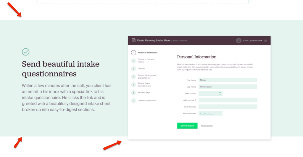
And then you have barely-there copy that is so important, but so smol.
The smol-est.
Yeah.. lemme just…

Content
Okay. This is where it gets a little interesting.
When analyzing a website’s content, I’m looking at the actual pages they’ve presented to me, feature pages, pricing, integrations, blog content—the full shebang.
There’s a few things I notice:
- What? No blog?
- There’s really no other content period…
- The About Us page is not an About Page
Totally cool that ClientSherpa hasn’t implemented a content strategy yet. (Most startups won’t right off the bat.)
I also have a feeling the super lean website is probably intentional, but I’d question if that makes sense for the target audience.
Do attorneys need more information before signing up for something like this?
I personally don’t know and I’d want to find out.
I always find it weird when a company doesn’t have a blog (or even like.. product updates or something), but there’s also just no way to stay in touch with ClientSherpa if I’m not ready to buy.
No social profiles.
No nada.
But perhaps the biggest thing I noticed was that the About Us page isn’t actually an About Us page!
It’s really more of a “How It Works” page.
I feel robbed! Bamboozled! Tricked!
(I’m just kidding—I’m not that mad..)
I legitimately wanted to read about the founders and their knight-in-shining-armor story about how they’re changing the way lawyers make more money!
I appreciate the “How It Works” page (because it’s actually really well done), but under the guise of an “About Us” could be both really strategic and also totally dismissive at the same time.
I do wonder if this helps conversion rates at all. If it does, somehow, then ignore me.
But if people bounce immediately on this page, I can take a guess as to why.
So does it pass The Conversion Test™️?
Overall—yes.
I think it passes.
If I were an eager attorney and I really felt the pain, I’d probably do the hard work of reading everything and piecing it all together.
But if I were a really skeptical or busy attorney, I’d probably bounce because it didn’t do enough to grab my attention.
I hate saying this but I feel like I’m going to say this a lot: It Depends™️.
It depends on goals, existing conversion rates, and various other factors we don’t have access to!
Even still, a splendid start!
Bravo, ClientSherpa! 👏
Action items for you, dear reader
1. Share if you liked this article! It lets me know I should keep doing them. 😂
2. If you want more, subscribe!
3. Let me know what website would you like to see next.